Tag Archives: CMYK

Illustrator Scripts for changing colors

Illustrator Scripts for changing colors

These are two scripts that are almost identical but one uses RGB colours and the other CMYK. For these to work correctly the Illustrator document needs to be put into the correct color mode (RGB or CMYK) from the File menu/Document Color Mode.
 
The parts of the scripts that you would need to change are at the top of the scripts. So for example in the CMYK variant of the script you would need to change one or more of the four values for the original color (the color that you are searching for) and the new color that you are replacing it with.
 
Be aware that this code is searching for paths and not images or text. For it to work with text it should have been converted to outlines before the code is run. The code could be enhanced to add this additional functionality. It would also be possible to add a CEP (HTML and JavaScript) user interface so that users could change the colors that way rather than directly in the script.
 
You will also see two flags:
				
					var changeFill = true;
var changeStroke = true
				
			
This are currently set so that both stroke and fill colors will be changed. Switching either of these to false will toggle that switch that setting off.
 
This is the CMYK variant:
				
					// Define the original color and the new color
var originalColor = new CMYKColor();
originalColor.cyan = 100;
originalColor.magenta = 100;
originalColor.yellow = 0;
originalColor.black = 0;
 
var newColor = new CMYKColor();
newColor.cyan = 0;
newColor.magenta = 0;
newColor.yellow = 100;
newColor.black = 0;
 
var changeFill = true;
var changeStroke = true
 
// Get the active document
var doc = app.activeDocument;
 
// Get all the top-level items in the document
var topLevelItems = doc.pageItems;
 
// Loop through all the top-level items
for (var j = 0; j < topLevelItems.length; j++) {
    // Check if the item is a path item
    if (topLevelItems[j].typename == "PathItem") {
        var fillColor = topLevelItems[j].fillColor;
        var strokeColor = topLevelItems[j].strokeColor;
        if(fillColor && changeFill){
            // Check if the fill color is the original color
            if (fillColor.typename == "CMYKColor" && fillColor.cyan == originalColor.cyan && fillColor.magenta == originalColor.magenta && fillColor.yellow == originalColor.yellow && fillColor.black == originalColor.black) {
                // Change the fill color to the new color
                topLevelItems[j].fillColor = newColor;
            }
        }
        if(strokeColor && changeStroke){
            // Check if the stroke color is the original color
            if (strokeColor.typename == "CMYKColor" && strokeColor.cyan == originalColor.cyan && strokeColor.magenta == originalColor.magenta && strokeColor.yellow == originalColor.yellow && strokeColor.black == originalColor.black) {
                // Change the stroke color to the new color
                topLevelItems[j].strokeColor = newColor;
            }
        }
    }
}


This is the RGB variant:

				
					// Define the original color and the new color
var originalColor = new RGBColor();
originalColor.red = 255;
originalColor.green = 0;
originalColor.blue = 0;
 
var newColor = new RGBColor();
newColor.red = 0;
newColor.green = 255;
newColor.blue = 0;
 
var changeFill = true;
var changeStroke = true
 
// Get the active document
var doc = app.activeDocument;
 
// Get all the top-level items in the document
var topLevelItems = doc.pageItems;
 
// Loop through all the top-level items
for (var j = 0; j < topLevelItems.length; j++) {
 
    // Check if the item is a path item
    if (topLevelItems[j].typename == "PathItem") {
var fillColor = topLevelItems[j].fillColor;
        var strokeColor = topLevelItems[j].strokeColor;
        if(fillColor && changeFill ){
            // Check if the fill color is the original color
            if (fillColor.typename == "RGBColor" && fillColor.red == originalColor.red && fillColor.green == originalColor.green && fillColor.blue == originalColor.blue) {
                // Change the fill color to the new color
                topLevelItems[j].fillColor = newColor;
            }
        }
        if(strokeColor && changeStroke){
            // Check if the stroke color is the original color
            if (strokeColor.typename == "RGBColor" && strokeColor.red == originalColor.red && strokeColor.green == originalColor.green && strokeColor.blue == originalColor.blue) {
                // Change the stroke color to the new color
                topLevelItems[j].strokeColor = newColor
            }
        }
    }
}


The scripts can be run by copying the code from this blog (just use the copy button on the top right) and saving either of them into files with a .js extension (for example ConvertColorRGB.js and ConvertColorCMYK.js). They can then be run from the Illustrator File/Scripts/Other Scripts menu.
Spot Colors

Spot Colors

Even if you’re not in the printing industry, you’ve probably used spot colors. For instance, they are on our walls and cars. They are surrounding us.

In offset printing, commercial printers specially formulate and pre-mix spot colours to achieve specific, consistent colours. They offer these as an alternative to process colours, which combine varying amounts of cyan, magenta, yellow, and black (CMYK) to create different hues in their print jobs. A color reference for the particular spot color type is often used to ensure accurate reproduction.

Spot colours excel in printing solid, bright colours and reproducing corporate colours or specific shades difficult to achieve with CMYK. They frequently serve in printing spot illustrations such as charts, maps, and diagrams and where brands need to be faithfully reproduced such as in printing Company logos and other color specific brand elements.

Spot Color Systems

In printing, there are several different spot colour systems that publish color references, each with their own set of colours. Here are a few examples:

Pantone Matching System (PMS): This is one of the most widely used spot colour systems for producing a wide range of printing colours. The Pantone system includes over 1,800 different colours, each with its own unique number, and is used by graphic designers and printers to ensure colour consistency across various printing methods and materials.

Toyo Color Finder: This spot color system, which is similar to PMS and offers a wide range of colours, is widely used in Asia, particularly in Japan.

RAL Classic: This is a spot colour system that is primarily used in Europe for industrial and architectural coatings, among other things. The RAL system has 210 colours, each with its own unique number.

Graphic designers and printers use the Focoltone system (FOur COLour TONE) to create spot colours for printing. The Focoltone system comes in a variety of colours, each with its own unique number.

DIC Color Guide: This system is popular in Asia and is used in the printing and packaging industries. The DIC system includes a wide variety of colours, each with its own unique number.

Pantone

The Pantone Matching System (PMS) is one of the most widely used spot colour systems, with a large colour palette to choose from. Here are a few examples of colours available in the Pantone system color references:
 
Pantone Red 032 is a vibrant, warm red that is ideal for creating eye-catching designs.
 
Pantone Green 347 is a vibrant lime green that is ideal for achieving a fresh, modern look.
 
Pantone Blue 286 is a deep, rich blue that is ideal for conveying elegance and sophistication.
 
Pantone Yellow 123: This is a bright, cheerful yellow that is ideal for conveying a cheerful and optimistic vibe.
 
Pantone Black: A rich, deep black that is ideal for conveying mystery and elegance.
 
Pantone Silver-10077-C: This is a metallic silver that is ideal for exuding elegance and luxury.
 
Pantone Gold 16-0836 TPX : This is a metallic gold that is ideal for conveying wealth and prestige.
 
These are just a few of the colours available through the Pantone Matching System. The spot color Pantone system has over 1,800 colours to choose from, and it is widely used by graphic designers and printers to ensure colour consistency across different printing methods and materials.
 
By not having to refer to CMYK percentages, then it is possible for the designer and the printer to achieve an exact match. They can simply refer to the spot color Pantone color charts.
pantone spot color matching

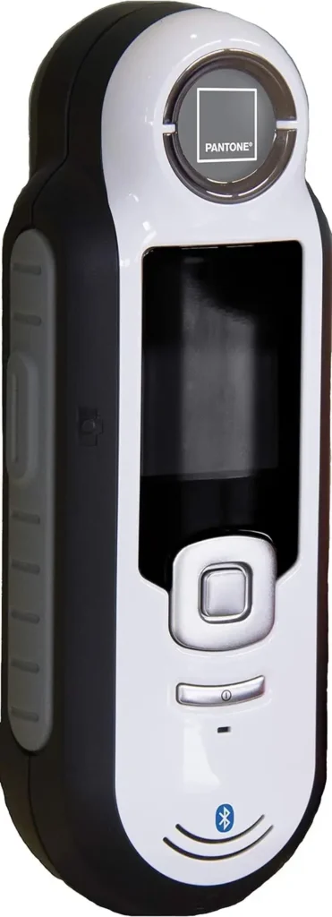
Pantone CAPSURE with Bluetooth | Portable Color Scanning & Matching Tool | RM200+BPT01

On Amazon Say goodbye to the frustration of trying to match colors by eye – introducing the Pantone CAPSURE with Bluetooth. This portable color scanning and matching tool is a game-changer for designers, artists, and anyone who works with color. With its large 1.75 inch-color viewing screen, you can easily store up to 100 color captures and toggle between multiple PANTONE Libraries at the touch of a button. But that’s not all – the CAPSURE automatically updates its color libraries through CAPSURE Sync, so you’ll always have access to the latest shades and hues. Compact and lightweight at just six ounces (including battery), it’s perfect for on-the-go use. And with over 10,000 preloaded PANTONE Colors in sRGB, Adobe RGB, HTML, Lab, and XYZ values specifically chosen for multimedia design projects, you’ll never struggle to find your perfect shade again. Upgrade your creative process with Pantone CAPSURE – where precision meets portability.

An Important Update on using Pantone colors in Creative Cloud Products 

Adobe’s Creative Cloud applications, including Photoshop, InDesign, and Illustrator, no longer support free Pantone spot colors. Customers must now pay a monthly ($15) or annual ($90) subscription fee via the Adobe Pantone Connect plugin in order to gain access to the entire collection of Pantone color books. This modification resulted from Pantone’s decision to alter its business model and require direct payment from customers. Some Photoshop users have reported that older files containing Pantone colors are now black. However, workarounds such as disabling updates and copying metadata values are available. See the full story.

2 Colorimeter (NEW) – Color Matching Tool, Sheen Matching, Paint Scanner – Identify Closest Matching Paint Colors, Sheen Levels, Digital Color Values for Painters and Designers

The COLOR MUSE 2 Colorimeter is a must-have for painters and designers seeking unmatched precision in color matching. With its advanced technology, this device can accurately identify the closest paint colors and sheen levels to your desired shade, making it perfect for any painting project. Its compact size and Bluetooth connectivity make it the ultimate on-the-go color analyst, enabling you to easily match colors wherever you are with the help of the user-friendly Color Muse app. From identifying sheen levels to providing access to an extensive library of top-quality paint brands, the COLOR MUSE 2 revolutionizes traditional color matching methods with over 95% accuracy. Say goodbye to guesswork and trust in the unparalleled accuracy of COLOR MUSE 2 for all your color matching needs.

Comparing Spot Color and Process Printing

Spot color printing is a technique used in the printing industry to reproduce solid colors that are not easily achieved with process printing. Process printing, on the other hand, involves mixing different percentages of cyan, magenta, yellow, and black (CMYK) colors to create a wide range of hues. Spot colors are pre-mixed ink colors that are specified using a color reference system such as Pantone or HKS. These inks provide more accurate and consistent results compared to process colors when reproducing specific shades or brand logos. In contrast, process printing is more cost-effective for projects requiring a large number of colors or gradients.

Combining Process and Spot Colors

In the printing process, spot colors can be combined with process colors to enhance certain elements within a design while maintaining color accuracy. This hybrid method allows for greater flexibility in achieving desired visual effects without compromising on quality. By incorporating spot colors strategically alongside CMYK inks during production, printers can achieve vibrant solid color areas and precise details within complex designs.

Overall, understanding the differences between spot color printing and process printing is crucial for designers and printers alike when striving for high-quality results in print projects and print jobs. Integrating spot and process coloring effectively requires careful consideration of ink choices, design elements, and overall project objectives to ensure optimal outcomes in the final printed piece.

Hexachome Colors

The Hexachrome color system is a six-color printing process that employs the traditional four process colors (cyan, magenta, yellow, and black) as well as two additional colors (green and orange) to increase the colour gamut, or range of colors that can be printed. This enables a wider range of colors to be printed with greater accuracy and more realistic image reproductions. Commercial printing applications that use the Hexachrome system include packaging, brochures, and point-of-purchase displays. These colors are typically printed on a six-color press or with a special type of inkjet printer with two additional cartridges compared to the normal CMYK printers.

Using Hexachrome in Adobe InDesign

Hexachrome colours can be defined and used in a variety of ways in Adobe InDesign and their is similar functionality in products such as Adobe Illustrator.

Swatch Libraries

Adobe InDesign includes a built-in Hexachrome swatch library, which can be accessed by selecting “Swatches” from the “Window” menu. When the swatches panel is open, choose “Open Swatch Library” and then “Hexachrome” to access the relevant colour swatche.

Color Settings 

In the “Color Settings” dialogue box in InDesign, you can also define Hexachrome colours. This is accessed by selecting “Color Settings” from the “Edit” menu. Select “Hexachrome” from the “Working Spaces” dropdown menu in the dialogue box.

Custom Colors 

Using the “Color” panel, you can also create custom Hexachrome colours. Select “Custom Color” from the fly-out menu when you open the panel. Then choose “Hexachrome” as the colour mode and adjust the values of each of the six colour channels (C,M,Y,K,O,G) to achieve the desired colour.

Color picker 

You can also use the colour picker tool to select any colour you want, then select “Hexachrome” from the colour mode drop-down menu.

Summary of Hexachrome usage

Generally, once the Hexachrome colors have been defined, you can use them in your designs just like any other colour, by selecting them from the swatches panel or applying them to objects and text.

It is worth noting that it is not a widely used color system and many printers, software and tools only support the CMYK color space, making it harder to find specialized Hexachrome equipment and software.

What next?

If you are interested in discussing our consultancy and software development services further then please send an email to info@creativeaddonshub.com by clicking the button below:

Understanding of Color and Color models

Understanding Color Models: A Beginner's Guide to Color Theory

I am only going to cover 2 of the many color models here because they are the most often used.

RGB

This color model is primarily used to describe light. It is used mainly in cameras and scanners. It has 3 color elements that when added together at 100% represent white or pure light. The 3 different colors are Red, Green and Blue. The color model is almost infinite in its range and this in itself is ok until printing is required and that printing is being done through the CMYK color model. The model uses 3 values with each being in a range between 0 and 255 as in the Windows and applications such as Photoshop or as a decimal number up to a maximum of 1 in PDF for example. 
 
RGB is an additive color model. Adding all of the colors in equal amounts will result in white.

In the web world RGB colours are represented by hex number combinations (the numbering system is ). So for example Red would be #FF0000, Green would be #00FF00 and Blue would be #0000FF. Black is #000000 and White is #FFFFFF. 

CMYK

What color model is used in printed designs? This is usually Cyan/Magenta/Yellow/Black (CMYK) color model and is mainly used in color printing.
 

Printing the colors on top of each other creates the colors necessary to achieve the required shades. Overlaps may be necessary at the edges (trapping) to prevent visibility of spaces as different paper types can expand and shrink when applying ink/toner. Compared to RGB, the CMYK color model offers a much more limited range, necessitating careful conversion from RGB to CMYK. Color management systems, the addition of extra colors to the print run (such as Hexachrome), or the use of pre-mixed Spot colors like Pantone can accomplish this. The resolution of the input and output and the paper stock used in printing, including the surface quality and base color of the media type as well as the ink attributes, affect printing. Moreover, varnishes such as UV and foils can modify and enhance output effects and colors to provide metallic effects.

The CMYK color model assigns 4 values, each representing a percentage of the four colors: cyan, magenta, yellow, and black.

CMYK operates as a subtractive color model, where adding all colors in equal amounts theoretically results in black. However, CMYK typically produces a dirty color, so incorporating the K (black) achieves a true black for printing.

This is a simple look at color and I will expand on this in a future blog.

Amazon link

Victor Perez’s “The Color Management Handbook for Visual Effects Artists” is a vital resource aimed at demystifying color management for VFX professionals. This guide, grounded in research from leading color scientists, navigates through the nuances of high dynamic range (HDR) and Academy Color Encoding System (ACES) workflows. It’s designed to educate artists at all levels, ensuring a solid grasp of color management principles to enhance the quality of visual effects globally. This comprehensive book covers from basic color theory to sophisticated digital imaging techniques, promoting a unified approach from camera to screen.