A Guide to Spectrum UXP Components and Design Guidelines
Discover how Spectrum UXP can help you create consistent and visually appealing user interfaces in Adobe XD and Photoshop plugins.
Introduction to Spectrum UXP
Spectrum is Adobe's design system that provides a unified visual language across all Adobe products. When building plugins and extensions for Adobe applications using UXP (Unified Extensibility Platform), developers are encouraged to use Spectrum components to ensure their interfaces feel native, consistent, and accessible. For background on the UXP platform itself, see our articles on UXP vs CEP in Photoshop, UXP Extensions in InDesign, and UXP for Illustrator: current status.
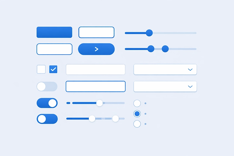
Spectrum UXP provides a rich set of web components that follow Adobe's design guidelines out of the box. These components handle styling, accessibility, and interaction patterns automatically, allowing developers to focus on functionality rather than reinventing UI patterns.
Why Use Spectrum UXP Components?
Using Spectrum UXP components offers several important advantages:
- Consistency: Your plugin's interface will look and feel like a natural extension of the Adobe host application.
- Accessibility: Spectrum components are built with accessibility in mind, including keyboard navigation, screen reader support, and proper ARIA attributes.
- Responsive design: Components adapt to different panel sizes and orientations within the host application.
- Dark and light themes: Spectrum components automatically respond to the user's chosen theme in the Adobe application.
- Reduced development time: Pre-built components save significant development effort compared to building custom UI elements.
Core Spectrum UXP Components
Action Buttons
Action buttons are used for triggering specific actions within your plugin. They are typically used in toolbars and action bars. Unlike standard buttons, action buttons can have a "quiet" appearance that blends into the surrounding UI until hovered.
<sp-action-button>
  <sp-icon-edit slot="icon"></sp-icon-edit>
  Edit
</sp-action-button>

<!-- Quiet variant -->
<sp-action-button quiet>
  <sp-icon-more slot="icon"></sp-icon-more>
</sp-action-button>
Buttons
Standard buttons are used for primary and secondary actions. Spectrum provides several button variants to indicate the importance and type of action:
- Accent (CTA): For the most important action on the page.
- Primary: For important but not primary actions.
- Secondary: For less prominent actions.
- Negative: For destructive actions like delete or remove.
<sp-button variant="accent">Save Changes</sp-button>
<sp-button variant="primary">Apply</sp-button>
<sp-button variant="secondary">Cancel</sp-button>
<sp-button variant="negative">Delete</sp-button>
Checkboxes
Checkboxes allow users to select one or more options from a set. Spectrum checkboxes support checked, unchecked, and indeterminate states.
<sp-checkbox>Enable auto-save</sp-checkbox>
<sp-checkbox checked>Show grid</sp-checkbox>
<sp-checkbox indeterminate>Select all layers</sp-checkbox>
Dividers
Dividers are used to visually separate content sections within your plugin panel. They provide a clean horizontal line that follows Spectrum spacing guidelines.
<sp-divider size="s"></sp-divider>
<sp-divider size="m"></sp-divider>
<sp-divider size="l"></sp-divider>
Links
Spectrum links maintain consistent styling with the host application's theme. They can be used inline within text or as standalone navigation elements.
<sp-link href="https://example.com">Learn more</sp-link>
<sp-link quiet>View documentation</sp-link>
Pickers (Dropdowns)
Pickers allow users to choose a single option from a list. They are equivalent to traditional dropdown or select elements but with Spectrum styling and behaviour.
<sp-picker label="Choose a layer">
  <sp-menu-item value="bg">Background</sp-menu-item>
  <sp-menu-item value="fg">Foreground</sp-menu-item>
  <sp-menu-item value="overlay">Overlay</sp-menu-item>
</sp-picker>
Radio Buttons
Radio buttons allow users to select exactly one option from a group. They should be wrapped in an sp-radio-group component to ensure proper behaviour.
<sp-radio-group label="Export format">
  <sp-radio value="png" checked>PNG</sp-radio>
  <sp-radio value="jpg">JPEG</sp-radio>
  <sp-radio value="svg">SVG</sp-radio>
</sp-radio-group>
Sliders
Sliders let users select a value from a continuous or discrete range. They are particularly useful in creative applications for adjusting properties like opacity, size, or intensity.
<sp-slider min="0" max="100" value="50" label="Opacity">
</sp-slider>

<sp-slider min="1" max="500" value="72" step="1" label="Font Size">
</sp-slider>
Text Fields
Text fields allow users to input text data. Spectrum provides both single-line text fields and multi-line text areas with consistent styling.
<sp-textfield placeholder="Enter layer name"></sp-textfield>

<sp-textfield type="number" value="100" min="0" max="1000">
</sp-textfield>

<sp-textarea placeholder="Enter description..."></sp-textarea>
Tooltips
Tooltips display contextual information when hovering over or focusing on an element. They are essential for explaining icon-only buttons and compact UI elements.
<sp-tooltip placement="bottom">
  This action cannot be undone
</sp-tooltip>
Typography
Spectrum UXP provides typography components and CSS classes that ensure text in your plugin matches the host application's typographic scale. Key elements include:
- Headings: Multiple levels (h1 through h6) with appropriate sizing and weight.
- Body text: Standard paragraph text that matches Adobe's typographic guidelines.
- Detail text: Smaller text for secondary information, labels, and metadata.
- Code text: Monospaced text for displaying code snippets or technical values.
<sp-heading size="L">Panel Title</sp-heading>
<sp-body size="M">Regular body text for descriptions.</sp-body>
<sp-detail size="S">Last modified: 2 hours ago</sp-detail>
Design Guidelines and Best Practices
When working with Spectrum UXP components, keep these design principles in mind:
- Spacing: Use consistent spacing between components. Spectrum defines spacing tokens (e.g., 4px, 8px, 16px, 24px) that should be used throughout your plugin.
- Layout: Arrange components in a logical flow. Group related controls together and use dividers to separate distinct sections.
- Feedback: Provide visual feedback for user actions. Use loading indicators, success states, and error messages appropriately.
- Responsiveness: Design your plugin panels to work at various sizes. Panels can be resized by users, so your layout should adapt gracefully.
- Theming: Test your plugin in both light and dark themes to ensure readability and visual consistency.
Getting Started with Spectrum UXP
To begin using Spectrum UXP components in your Adobe plugin, you simply need to use the appropriate HTML tags in your plugin's panel markup. UXP automatically provides the Spectrum web components within the plugin runtime environment, so no additional imports or package installations are required.
Refer to Adobe's official UXP documentation and the Spectrum design system website for the complete component reference, design tokens, and additional guidelines. If you need help building a UXP plugin with Spectrum components, see our UXP development page or custom software services.
Related Articles
UXP vs CEP Extensions in Adobe Photoshop
Compare Adobe's modern UXP platform with the older CEP framework — what's changed, what's better, and how to choose between them when building Photoshop extensions.
UXP Extensions in Adobe InDesign with Code Examples
Build modern UXP plugins for Adobe InDesign with practical code examples covering panels, document automation, and editorial workflows.
UXP for Illustrator: Current Status and What to Use Today
UXP support in Illustrator is still maturing. Find out what's available now, what's coming, and which extension technology to choose for new Illustrator projects.
Need Help Building Adobe Plugins?
Mapsoft has over 30 years of experience developing Adobe plugins and extensions. Get in touch to discuss your project.