Illustrator Map Production Workflows: Cartography, GIS Handoff & Print Export
Most commercial maps you’ve seen on a printed page were finished in Illustrator. Here’s why — and the production workflow that takes a GIS export from QGIS or ArcGIS, refines it through MAPublisher, and ships it to a press as PDF/X-4 with the correct bleed, output intent, and label hierarchy.
When Illustrator is the right tool
The honest answer to "ArcGIS or Illustrator?" is "both, in sequence". GIS systems are unmatched at spatial analysis, attribute management, and reproducible data-driven cartography. They are bad at typography, label placement, and the small craft decisions that separate a map you can read from a map you struggle with. Illustrator is excellent at exactly those things and indifferent to spatial analysis. The commercial workflow that has stabilised over thirty years of digital cartography is GIS for analysis, Illustrator for finishing.
That handoff has a clear test: has the data stopped changing? While the underlying spatial data is still being analysed, edited, or restructured, it stays in the GIS. Once the data is stable and the question becomes "how does this map look on a page?", the work moves to Illustrator. Most commercial cartography — print atlases, transit maps, tourism guides, magazine maps, packaging maps, infographics — lives in this finishing phase.
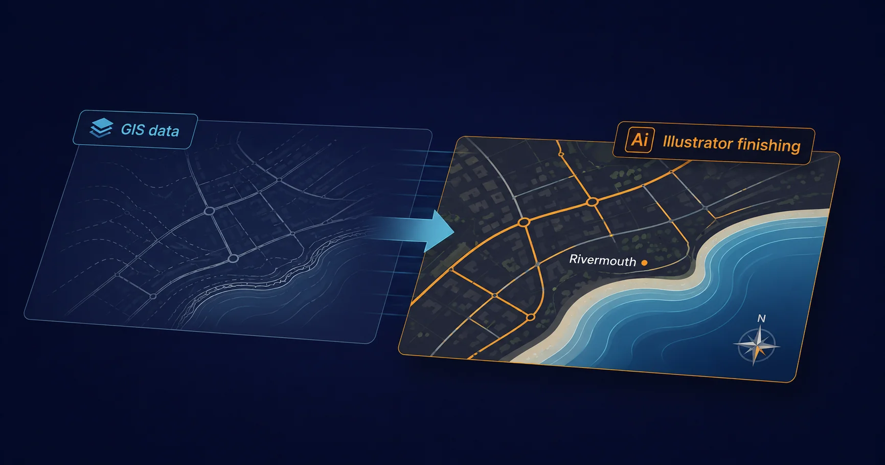
The GIS → Illustrator handoff
Three common paths from GIS data to Illustrator artwork:
1. SVG export — the lowest-friction option
Both QGIS and ArcGIS Pro export to SVG natively. The output opens directly in Illustrator with the layer structure preserved (one SVG group per GIS layer becomes one Illustrator layer), feature attributes lost, and georeference stripped. This is the right path when the map is visually static — no further GIS-style editing needed, no need to query features by attribute, no requirement to re-project later.
The friction is real but bounded: paths come in as point-by-point Bezier curves, fills and strokes match the GIS symbology approximately, and labels are usually a separate import step (GIS-rendered labels become outlined paths in SVG, which means you can’t edit them as text). For a one-off map this is fine. For an ongoing series with iterative updates, MAPublisher is better.
2. Avenza MAPublisher — the workhorse
MAPublisher is the dedicated Illustrator plug-in for cartographic work. It imports shapefiles, GeoJSON, KML, GeoTIFF, and most other GIS formats, and crucially it preserves the geographic coordinates inside the Illustrator document. That means features remain georeferenced — you can re-project on the fly, query features by attribute, and round-trip data back to GIS without losing precision. For any project where the map needs to be regenerable from updated source data, MAPublisher is the right tool.
The plug-in adds menus and panels for the cartography-specific operations Illustrator doesn’t do natively: coordinate-system management, geographic measurement tools, attribute-driven styling, label placement engines that respect feature geometry, and export back to GIS formats. Most professional cartographic studios use it as their primary Illustrator plug-in.
3. Avenza Geographic Imager — for raster basemaps
Companion to MAPublisher, Geographic Imager handles georeferenced raster imagery (satellite, aerial, scanned terrain) inside Photoshop, with the imagery exported to Illustrator as the basemap. Used for maps where the visual base is photographic or terrain-shaded and the cartographic features are vector overlays drawn in Illustrator on top.
Layer architecture for legibility
The single most important production decision in a complex map is the layer structure. A flat layer list is unworkable as soon as the map has more than a handful of feature types; the standard pattern, used in most professional cartography, is a hierarchical structure that mirrors the cartographic stack:
Map
├─ Marginalia (legend, scale bar, north arrow, credits)
├─ Labels
│  ├─ Settlement labels
│  ├─ Road labels
│  ├─ Hydrographic labels
│  └─ Other labels
├─ Symbols (icons, callouts, point features)
├─ Transport
│  ├─ Motorways
│  ├─ A-roads
│  ├─ Other roads
│  └─ Railways
├─ Built-up areas
├─ Hydrography (rivers, lakes, coastline)
├─ Land cover (forest, parkland, urban)
└─ Basemap (terrain, relief, neat line)
The order matters. Stacking from bottom to top — basemap, land cover, hydrography, transport, settlements, labels, marginalia — matches the cartographic z-order that produces legible output. Reordering breaks the visual hierarchy in ways that are hard to undo later.
The flat-layer alternative ("everything in one layer with thousands of objects") works for tiny maps and breaks immediately on anything larger. The structured approach pays off the first time you need to globally restyle every motorway, hide all settlement labels for a black-and-white print, or generate a regional variant by toggling layer visibility.
Symbol libraries and consistent styling
The cartographic equivalent of a brand swatch library is a symbol library: a single Illustrator file (or a series of them) containing every map symbol the studio uses, defined as Illustrator graphic styles, symbols, and swatches. Every map in the project draws from this library. When the library updates, every map can be re-styled by re-importing.
Three principles that keep symbol libraries usable at scale:
- Name everything explicitly. Anonymous swatches, "Symbol 1", "Symbol 2" become unmaintainable within weeks. Every entry in the library has a descriptive name and a category prefix.
- Symbols, not groups. Illustrator symbols (placed via instance) update everywhere when the master changes. Pasted-and-grouped artwork doesn’t. Use symbols for anything that recurs.
- Graphic styles for line work. Roads, rivers, contours all use Illustrator graphic styles — named definitions of stroke colour, weight, dash pattern, and effects. A graphic style change propagates to every object using it.
Label placement — the hardest part of cartography
Automated label placement is hard. The rules a human cartographer applies (don’t cross water with land labels, follow the curve of a river, avoid overlapping with major roads, prioritise readability over completeness) don’t reduce cleanly to algorithm. Illustrator’s native text placement gives you typography but no awareness of the underlying features. MAPublisher’s LabelPro engine provides feature-aware placement — settle labels along curves, push them away from neighbours, prioritise by importance — which closes most of the gap.
For the cases neither tool handles cleanly (highly dense urban map labelling, cartograms, schematic transit maps), the production reality is that a human places the final 5–10% of labels by hand. Scripted approaches can prepare the placement to within striking distance; the last decisions stay with the cartographer.
Scripted map series
Map series — producing twenty regional variations of the same template, each with different feature emphasis, labelling, and colour scheme — are a natural fit for ExtendScript automation. The pattern: design one canonical template, drive variation by manipulating layer visibility, swatch values, and label visibility from a manifest, and export each variant to PDF/X-4 with bleed.
(function () {
  var manifest = readJson(new File('regions.json'));
  // [{ region: 'north', highlight: 'transport',
  //    swatchScheme: 'cool', outputName: 'north-map' }, ... ]

  for (var i = 0; i < manifest.length; i++) {
    var spec = manifest[i];
    var doc = app.open(new File('templates/master.ai'));

    setLayerVisibility(doc, spec.region);          // show only this region
    setHighlightLayer(doc, spec.highlight);        // emphasise transport / hydrology / etc.
    applySwatchScheme(doc, spec.swatchScheme);     // cool / warm / mono
    regenerateScaleBar(doc, spec.scaleKm);

    doc.saveAs(new File('output/' + spec.outputName + '.pdf'),
      pdfOptions({ preset: 'PDF/X-4:2010', bleed: 3 }));
    doc.close(SaveOptions.DONOTSAVECHANGES);
  }
}());
This is the same folder-loop pattern as any production batch — covered in detail in Illustrator batch processing, with reusable building blocks in our free 100-script collection. The cartographic specifics live in the helper functions: setLayerVisibility walks the layer tree to show only features in the named region; applySwatchScheme looks up colour values from the symbol library; regenerateScaleBar redraws the scale bar artwork at the right kilometre count for the printed scale.
Export — print and web are different files
Most map projects need both a print deliverable and a web one. They are not the same export from the same source:
Print export — PDF/X-4
- Format: PDF/X-4:2010 (the modern default for commercial offset and digital print)
- Colour: CMYK + spot, with the printer’s output intent embedded (FOGRA39, GRACoL2013, SWOP, or equivalent)
- Bleed: 3mm around the trim, with crop marks visible at the page edge
- Fonts: Fully embedded, not subset — allows last-minute label corrections at the prepress stage
- Image resolution: 300 dpi for halftone basemaps, 1200 dpi for vector line work where rasterised
- Transparency: Live (PDF/X-4 supports it natively); flatten to PDF/X-1a only if the printer specifies
For maps with extensive black labelling, a rich-black correction pass is worth doing — pure 100K black on a digital press can look thin on dense areas; a CMYK rich-black mix (often 60-40-40-100) gives heavier coverage. This is one of the small craft adjustments that distinguishes commercial cartographic output.
Web export — SVG, PNG, or web PDF
- Format: SVG for interactive web maps, PNG (with @2x retina variant) for static maps, web-optimised PDF for downloadable high-resolution variants
- Colour: sRGB throughout
- Resolution: 144 dpi for raster (retina-quality on most screens); SVG is resolution-independent
- File size: aggressive compression, image downsampling, font subsetting
- Linearisation: on for any PDF variant (Fast Web View)
- Interactivity: SVG can carry hyperlinks per feature; PDFs can carry hyperlinks on text and shape annotations
The two outputs are usually generated from the same Illustrator source by the same export script, with different presets per format. The print/web parameter differences are covered in detail in Print PDF vs Web PDF.
The honest take
Illustrator’s position in cartography is the same as its position elsewhere: it’s the tool you use after the data is stable and the question becomes a craft one. GIS handles the spatial analysis; MAPublisher carries the data into Illustrator without losing georeference; symbol libraries and structured layers let the design scale; ExtendScript automates the variation; PDF/X-4 ships the result.
The mistake most often seen in commercial cartographic work is treating Illustrator as the GIS, hand-drawing what should be data-driven and then wondering why the next regional variant takes a week per map. The right discipline is data-in / craft-out: keep the data structured, keep the symbol library central, and use Illustrator for what it’s genuinely best at. For projects that need a bespoke cartographic plug-in beyond what scripting can deliver, see Illustrator extension technologies for the framework comparison.
Related Articles
Illustrator Batch Processing
The folder-loop and manifest-driven batch patterns that drive scripted map series — naming conventions, error handling, multi-format export.
Illustrator Automation: When Scripting Beats Clicking
The threshold of "do it once" vs "script it", the four levers (Actions, ExtendScript, CEP, C++ SDK), and the practical decision framework for picking the right automation tool.
Illustrator Variable Data Workflows
Data-driven design at production scale — the same template-and-manifest pattern that powers map series, applied to personalised PDF output.
Building a Cartographic Pipeline?
Mapsoft has built scripted map production tooling and custom Illustrator extensions for cartographic studios for over thirty years — from regional map series automation to bespoke cartographic plug-ins.
Mapsoft is an Adobe affiliate. We may earn a commission on Adobe purchases made through these links, at no extra cost to you.