Spot Colours in Print and PDF
Understanding what spot colours are, how they differ from process colours, how the Pantone Matching System works, and how spot colours are defined and handled inside PDF documents.
You can also convert PDF colour spaces online for free using Mapsoft's PDF Hub — no installation required.
Process Colour vs. Spot Colour
Most commercial printing uses the four-colour process model, abbreviated as CMYK: Cyan, Magenta, Yellow, and Key (Black). By overprinting tiny halftone dots of these four inks at varying densities and angles, a press can reproduce a wide range of colours through optical mixing. For a broader look at how these colour models work, see our article on understanding colour models: RGB and CMYK. Virtually all photographic images and complex illustrations are reproduced this way, and using a fixed set of four inks for every job keeps press setup cost reasonable.
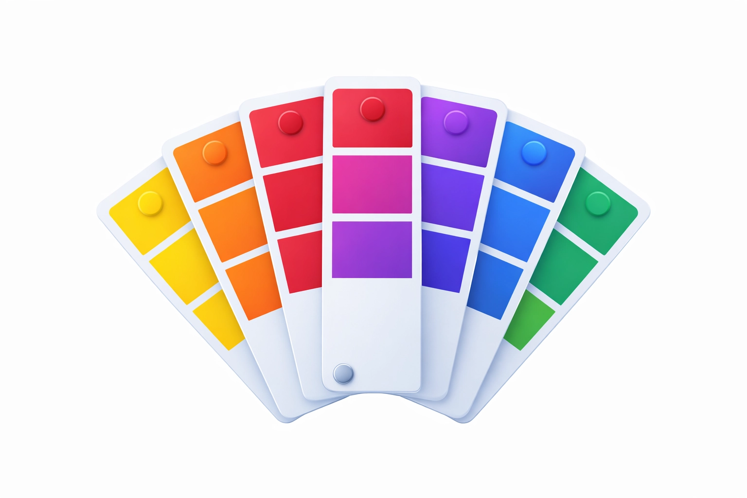
A spot colour is a pre-mixed ink printed as its own separate layer. Rather than building a colour from CMYK halftone dots, the press applies a specially formulated ink directly to the substrate. Each spot colour requires its own printing plate and its own pass through the press — or its own dedicated ink unit on a multi-colour press. The trade-off is significant: you get a colour that is exact, consistent, and often impossible to achieve with CMYK alone, including vivid oranges, metallics, fluorescents, and very pure blues or greens that fall outside the CMYK gamut.
The Pantone Matching System
The most widely used spot colour standard in commercial print is the Pantone Matching System (PMS), developed by Pantone LLC and first published in 1963. Pantone assigns a numeric code — such as Pantone 485 C for a vivid red — to each of its thousands of standardised inks. Designers specify a PMS colour by number, and the print shop uses the corresponding Pantone-formula ink, ensuring that the colour produced in London matches the colour produced in Chicago, regardless of press or paper stock.
Pantone publishes printed swatch books (called Pantone Guides) showing how each colour appears on coated stock (C), uncoated stock (U), and other substrates. Because ink absorbs differently into different papers, the same Pantone ink number looks noticeably different on coated versus uncoated stock, and the swatch books reflect this. Designers working on brand-critical colour — corporate logos, packaging, or safety markings — typically specify both the PMS number and the substrate to ensure accurate output.
Pantone also publishes CMYK and Lab equivalents for each of its colours, which serve as approximations for digital output and proofing. These equivalents are always approximations: many PMS colours, particularly vivid oranges, greens, and purples, have no accurate CMYK equivalent, and the printed result when converting to process will look noticeably duller or shifted.
Spot Colours in PDF: Separation Colour Spaces
PDF represents spot colours using a colour space type called Separation, defined in the PDF specification. A Separation colour space is defined by two elements: the name of the colorant (for example, PANTONE 485 C) and an alternate colour space with a tint transformation function. The alternate colour space — usually DeviceCMYK or an ICCBased space — provides an approximation of the spot colour for devices that cannot print the actual spot ink, such as desktop inkjet printers or display screens. The tint function maps a single ink percentage (0.0 to 1.0) to a corresponding value in the alternate space.
This design means a PDF carries both the true spot colour name for RIPs and presses that understand it, and a fallback representation for general-purpose viewing and proofing. PDF viewers and RIPs that recognise the colorant name use the real ink; those that do not fall back to the CMYK or RGB approximation automatically. For a spot colour to print correctly on press, the colorant name in the PDF must match the name that the RIP or press workflow expects — name mismatches are a common source of prepress errors, sometimes resulting in an extra unwanted separation plate.
When to Use Spot Colour
Spot colours are the right choice when colour accuracy is non-negotiable. Brand guidelines for major corporations almost always specify one or two PMS colours for logos and key design elements. A single-colour or two-colour print job — a business card or simple letterhead — is typically cheaper to run with spot inks than with a full four-colour process setup, since fewer ink units are required. Spot inks also provide the only route to certain effects: metallic silvers and golds, fluorescent highlights, and very dense solid areas that CMYK cannot reliably reproduce.
For documents with photographic imagery or complex gradients, process colour is more practical. Running five, six, or more inks on a press adds setup time and cost per sheet, so spot colours are usually reserved for the elements that genuinely require them. A common hybrid approach uses four-colour process for photographic content plus one or two spot colour plates for a brand logo or key colour element.
Converting Spot to Process for Digital Output
When a PDF containing spot colours is output to a device that handles only CMYK — a standard digital press or an office printer — the spot colours must be converted to process equivalents. For workflows that also push beyond standard CMYK, see our article on Hexachrome and extended-gamut printing. This conversion uses the alternate colour space defined in the Separation colour space, or a custom CMYK equivalent specified via a colour management profile or Acrobat's Ink Manager. The result is always an approximation.
Prepress professionals use soft-proofing — a display simulation of how the spot-to-CMYK conversion will look — to assess the visual impact before committing to a press run. Acrobat Pro's Output Preview tool can simulate the appearance of spot colour conversions on screen. If the conversion result is unacceptable, the design may need adjustment to use colours that CMYK can reproduce faithfully, or the job may need to retain the spot colour plates.
Overprint Behaviour with Spot Colours
When two ink layers overlap on press, the default behaviour is knockout: the uppermost ink replaces the ink beneath it, and the substrate shows only the top layer. Overprinting is the alternative, where the upper ink is printed on top of the lower ink and the two combine physically. For spot colours, overprint decisions are critical. Black spot colour plates are almost always set to overprint, so that fine black text does not produce a white halo where it knocks out a coloured background — a problem that becomes visible under even slight press misregistration. Other spot colours may or may not overprint depending on the desired visual effect, including intentional ink mixing to create a third colour.
PDF preserves overprint intent through the graphics state, and prepress applications expose these settings for review before output. Acrobat Pro's Output Preview tool includes a "Simulate Overprinting" option that shows how the document will actually print, making overprint errors visible before the file reaches the press.
Related Articles
The Importance of Barcodes in Modern Society
Explore the different types of barcodes, their applications across industries, the algorithms behind them, and how they are rendered using fonts, raster, and vector graphics.
Image Formats for PDF: JPEG, PNG, TIFF, and More
Comparing image file formats used in PDF documents — JPEG, PNG, TIFF, JBIG2, CCITT, and JPEG 2000 — their compression methods, quality trade-offs, and best use cases.
Understanding Colour Models: RGB and CMYK
A practical guide to RGB and CMYK colour models — how they work, their differences, and why colour management matters when converting between screen and print.
Work with Spot Colours Programmatically
Mapsoft's PDF solutions give developers and prepress professionals precise control over spot colour handling, Separation colour spaces, and ink management in PDF workflows.